Common usability errors. How to detect failures in your UX?
Redacción
7m of reading
The usability of applications and web pages is one of the most important aspects to attract visitors and, if you want to sell through this tool, achieve the desired conversion.However, this issue is often not focused and managed correctly. Usability errors on a website come at a high cost.
The design of a website or application should always be user-centered, flawless, and robust.
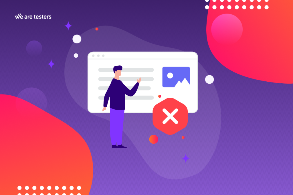
The user should feel comfortable navigating, motivated to continue. If they have to spend more time than necessary searching for what they want, finding the content they’re looking for, or encountering sections and buttons that lead nowhere, they will eventually leave. Lost visits, and perhaps forever.
This is the specialty of the discipline called UX design, which works precisely to offer the best browsing experiences.
The Importance of User Experience in Navigation
It doesn’t matter how beautiful or attractive your web application is; if a user can’t figure out how to navigate it, they will go to the competition. Often, we believe that the user experience, the navigation, has no flaws because we don’t get lost. Of course, if we have been responsible for web design, we have spent a considerable amount of time navigating, and we will naturally know how to move around.
Most Common Usability Errors on Websites
Yes, it’s true. When designing a website, you can make numerous usability errors. Here are the most common ones:
Usability Errors Affecting User Navigation
Ensuring a smooth navigation experience for users is highly recommended, almost mandatory.
Did you know that today, most users browse the internet on their mobile phones? That’s why designing with mobile usability in mind is absolutely necessary. It’s not enough to «adapt» web design to mobile.
You need to design with a mobile-first mentality, design the website for mobile, and then adapt it for the web version.
It’s also necessary to consider that pop-ups can become very annoying and heavy very quickly. The same goes for videos and audios that autoplay.
Usability Errors Related to Design
It may be that the colours chosen for the background and text on a website or application are very nice, but if the user has to strain their eyes to understand something, it’s not worth it.
In addition, font size is a detail that needs attention. Text is included for as many users as possible to read, right? Then, facilitate easy reading.
Another factor to consider is that many websites do not indicate where users are in the navigation. If the user doesn’t know where they are on your website, they are likely to get lost.
Usability Errors That Affect Site Loading Speed
We all know that we live in a fast-paced society where we expect to get what we want immediately. We have no patience.
When we enter a website and click something, we want there to be almost no waiting time. So, be very careful with website loading speed.
It’s also another factor that affects search engine rankings.
To achieve this, try to use lightweight images, and, as a general rule, avoid overloading them with too many elements.
Errors in UX Structure
All websites must answer certain basic questions. It’s true that these questions vary depending on the type of site, but users must always know where to find the answers to these questions.
Also, consider that there are certain unwritten rules about some aspects of web design: your company’s logo should be clearly visible in the header (usually on the top left side), and it should link to the home page; social media icons should be in the header or footer to avoid redirecting users away from your website; ads should not be more prominent than your content, etc.
And remember, instead of designing a website haphazardly, plan it first.
How to Detect Usability Errors
In the previous points, the importance of UX and usability errors has been made clear. But could you point out the UX errors on your website? You may find some at first glance, but if you want to conduct a thorough search, you should perform specific analyses.
For example, with a heat map, you can see which parts of your website are clicked on the most and which are clicked on the least. It’s a very visual way to analyze which parts of your website are the most attractive.
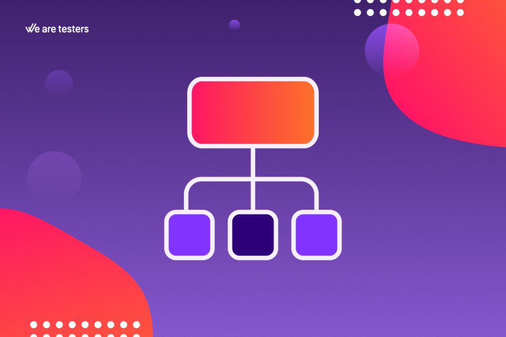
Concept maps are also an excellent tool to consider. Like heat maps, it’s a highly visual tool that allows you to represent various thoughts and concepts. This usually makes it easier to form an overall picture and identify problems within the whole.
If you’re concerned about the overall structure of your site, we recommend using card sorting. Essentially, it involves forming a group of different people and asking them to organize the website’s content on cards. Once all the cards are collected, the results are compared to discover common patterns.
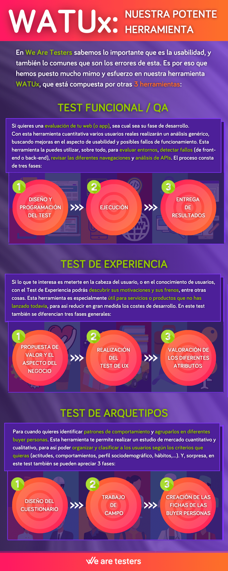
However, if you need a tool that serves all these purposes and more, a kind of Swiss army knife, We Are Testers has developed the perfect tool for you: WATUx.
How to Discover Usability Errors?
At We Are Testers, we know how important web usability is and how common usability errors are. That’s why we have put a lot of care and effort into our tool WATUx.
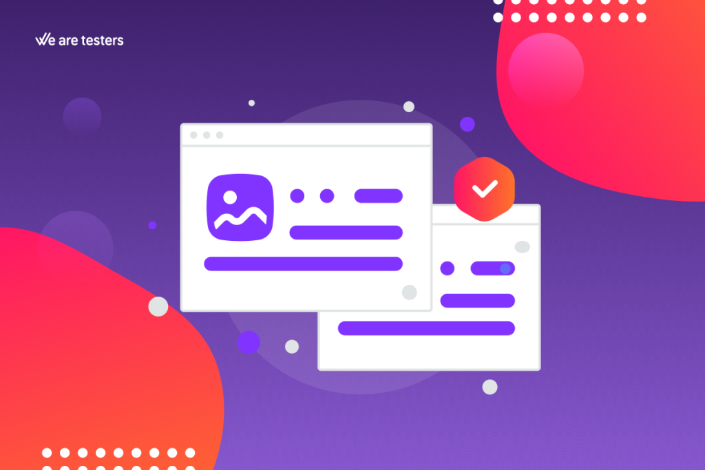
Thanks to this powerful tool, you can identify both the errors you are making and the potential improvements you can make to your website (because not all of them are faults).
WATUx is also composed of three other tools:
Functional Test / QA
If you want an evaluation of your website (or app), regardless of its development stage, the Functional Test / QA is for you. With this quantitative tool, several real users will conduct a generic analysis, looking for usability improvements and potential functional failures.
You can use this tool, especially for evaluating environments, detecting failures (front-end or back-end), reviewing different navigations, and API analysis.
The process consists of three phases: the test is designed and programmed in the first phase, executed in the second phase, and the results are delivered in the third phase.
Remember that you will have our staff’s assistance at your disposal throughout the process.
Experience Test
If you’re interested in getting into the user’s head or understanding user knowledge, the Experience Test can help you discover their motivations and obstacles, among other things.
This tool is especially useful for services or products that have not been launched yet, to greatly reduce development costs.
This test also differentiates between three general phases: the value proposition and business analysis in the first phase, UX testing in the second phase, and the evaluation of different attributes (design, usability, product, etc.) in the last phase.
Archetype Test
When you want to identify patterns of behaviour and group them into different buyer personas.
The User Archetype Test allows you to conduct both quantitative and qualitative market research, so you can organize and classify users according to the criteria you choose (attitudes, behaviours, sociodemographic profile, habits, etc.).
Surprisingly, this test also consists of three phases: the questionnaire design phase, the fieldwork phase, and the creation of buyer persona profiles phase.
As with the previous tests, you will have our assistance throughout the entire process.
Update date 14 April, 2024
Get in touch with our experts and discover how to take your research further.
Following the usability heuristics will help your website adapt to the natural way users navigate the internet. This way, it will be easier for users to browse with greater satisfaction, find what the...
The navigation tree has a big impact on the user experience. If they don't find what they want in a few clicks, they will lose patience and look elsewhere. To avoid that, UX research helps you to crea...
Web usability is key to the success of any website, which is why it's important to take a look at how users behave on the Internet in 2023. These are the conclusions drawn from real usability testing ...
We use our own and third-party cookies to analyze the use of the website and improve users browsing experience. More information at the Cookie policy
Functional
Always active
The storage or technical access is strictly necessary for the legitimate purpose of enabling the use of a specific service explicitly requested by the subscriber or user, or for the sole purpose of carrying out the transmission of a communication over an electronic communications network.
Preferences
The storage or technical access is necessary for the legitimate purpose of storing preferences that are not requested by the subscriber or user.
Statistics
The storage or technical access that is used exclusively for statistical purposes.El almacenamiento o acceso técnico que se utiliza exclusivamente con fines estadísticos anónimos. Sin un requerimiento, el cumplimiento voluntario por parte de tu Proveedor de servicios de Internet, o los registros adicionales de un tercero, la información almacenada o recuperada sólo para este propósito no se puede utilizar para identificarte.
Marketing
The storage or technical access is necessary to create user profiles to send advertising, or to track the user on a website or across several websites for similar marketing purposes.